Production-grade design system for iOS and macOS. Token-based theming, style-swappable components, Liquid Glass support, and full Swift 6 concurrency safety — built to swap visual styles without changing component code.
All visual decisions — colors, spacing, radii, shadows, typography — live in design tokens. Swap a theme at runtime without touching component code.
Components accept a style parameter rather than hardcoding visual choices. Ship multiple visual variants of the same component from a single codebase.
Native Liquid Glass material integration for components that use the translucent, depth-aware surface treatment available on visionOS and modern iOS.
Fully audited for Swift 6 strict concurrency. No data races, no Sendable warnings. Safe to use with async/await and Swift actors without suppressing compiler checks.
Components adapt to both platforms. Platform-specific idioms (navigation patterns, sizing, tap vs hover states) are handled inside the system, not in your app code.
Full component reference, token documentation, and integration guides at the DesignFoundation docs site. Every component shows live code examples alongside rendered output.
.package(url: "https://github.com/NerdSnipe-Inc/design-foundation", from: "1.0.0")https://github.com/NerdSnipe-Inc/design-foundationRequires Xcode 16 or later and Swift 6. Add DesignFoundation as a target dependency after adding the package.
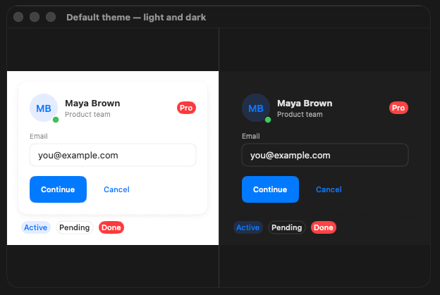
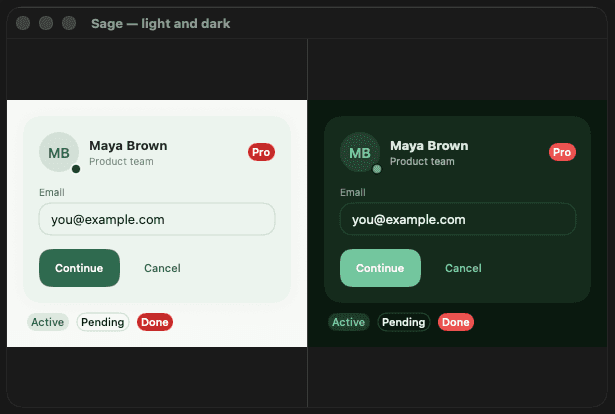
Each preset ships a light and dark theme in a single image. The dfThemePreset() modifier reads the system color scheme and switches automatically — no conditional logic in your views.

Default — System semantic colors. Fully adaptive, no preset required.

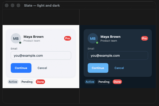
.slate — Professional, navy-slate brand. Default radius and shadows. Best for SaaS dashboards and developer tools.

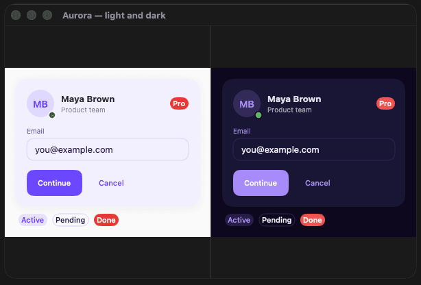
.aurora — Electric violet. Rounded corners, soft shadows. Best for creative tools and consumer apps.

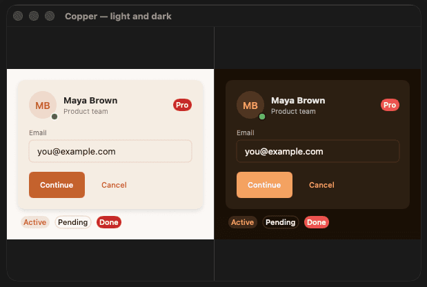
.copper — Warm amber on cream. Sharp corners, defined shadows. Best for finance and premium lifestyle apps.

.sage — Deep sage green. Very rounded corners, airy shadows. Best for health, wellness, and lifestyle apps.
Most SwiftUI design systems hardcode visual choices into components. Changing a border radius means finding every component that uses it. DesignFoundation inverts this — components reference tokens, tokens reference the current theme.
You can ship a light theme, a dark theme, a high-contrast accessibility theme, and a branded white-label theme from the same component library without duplicating any logic.
Liquid Glass support is built in, which is the primary new surface treatment on visionOS. Component support for the full visionOS layout model is in progress.
Yes. DesignFoundation components are standard SwiftUI Views. Adopt them incrementally — you don't need to rewrite existing screens to start using the token system.
Yes — DesignFoundation was extracted from production iOS development work at NerdSnipe Inc. It is used in shipping apps before being open-sourced.
Token-based theming, Swift 6 safe, Liquid Glass ready. One design system, multiple themes, no component rewrites.